Design comparison
Same person. Two prompts.
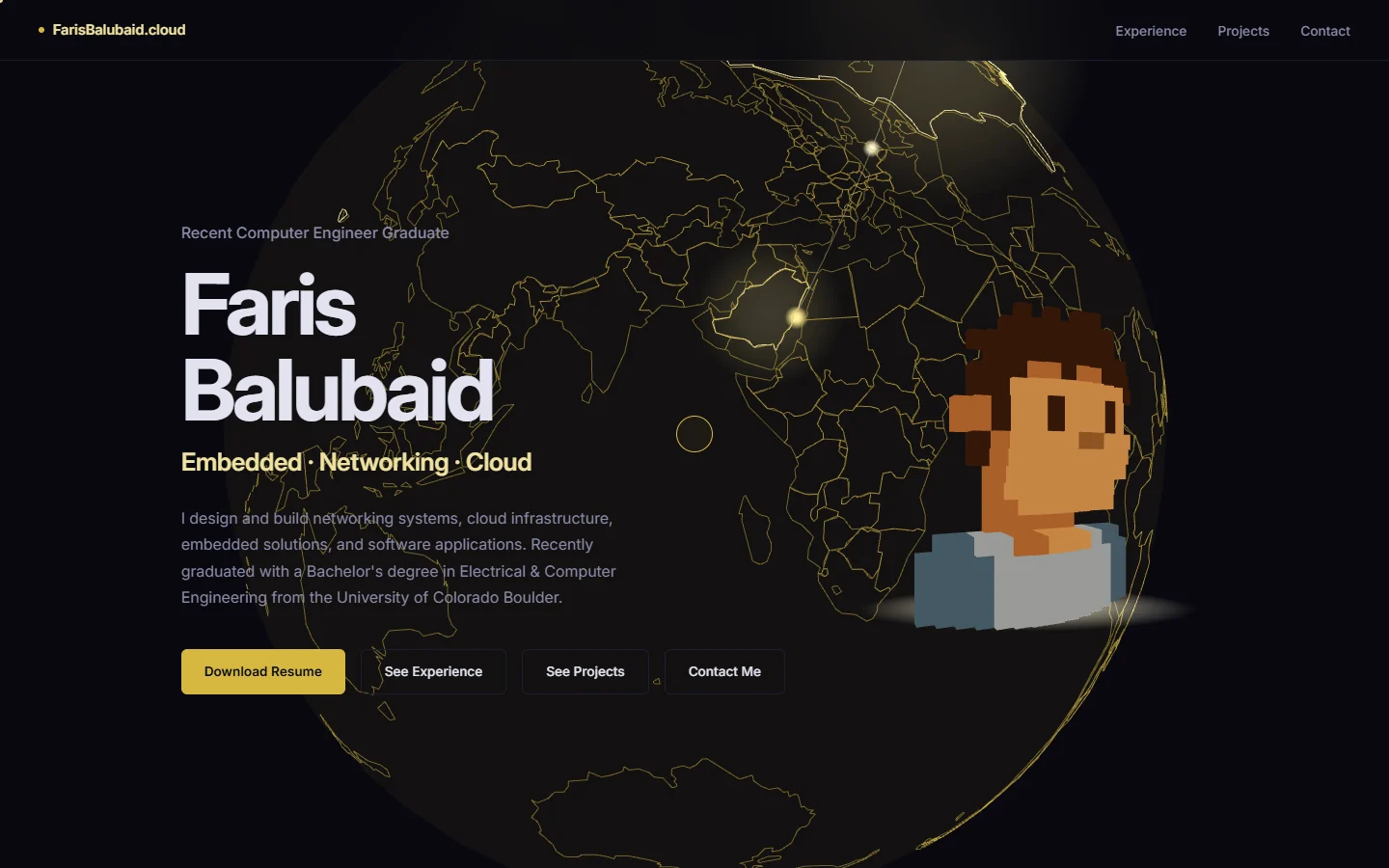
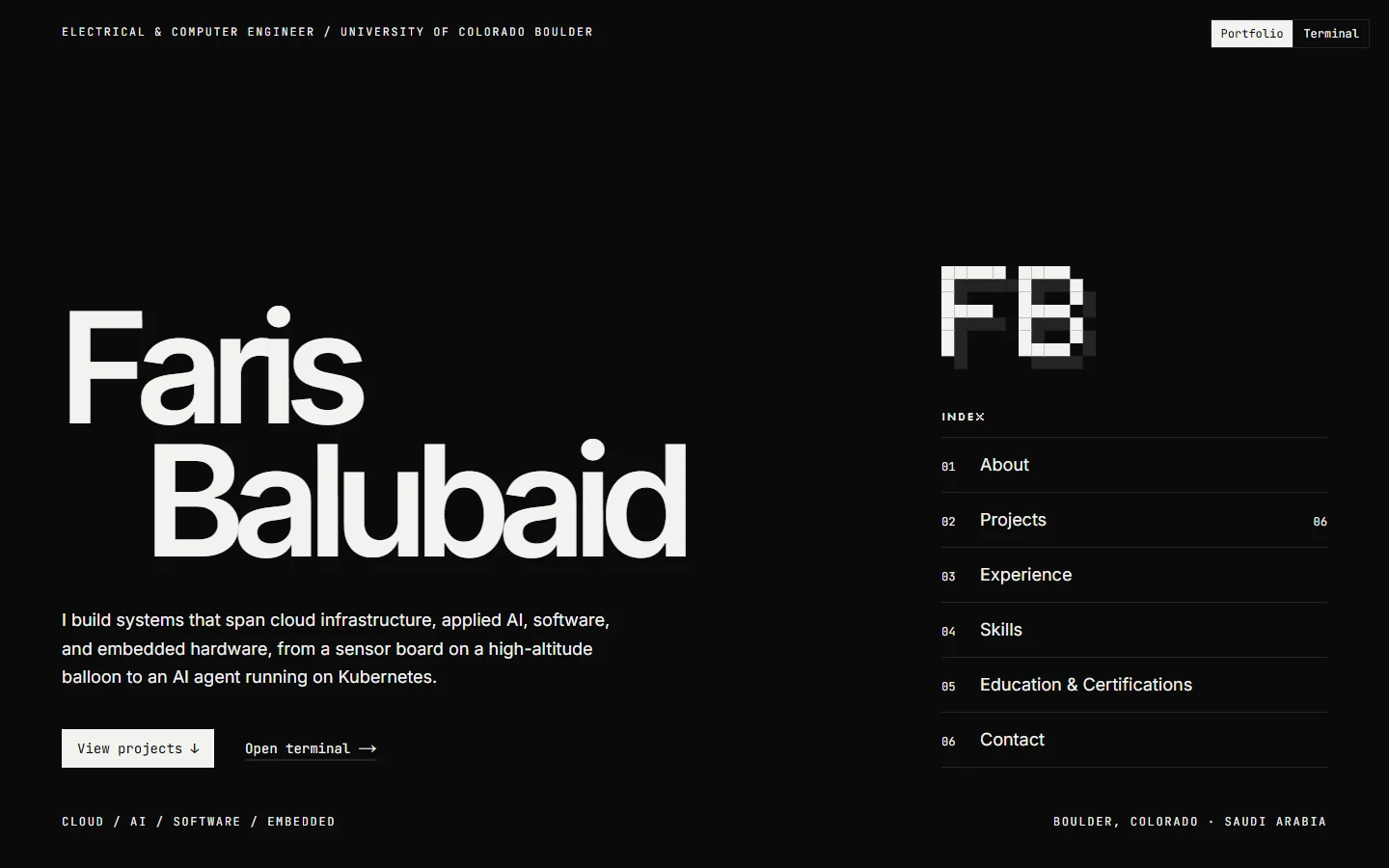
Both homepages, cut in half. On the left, my old portfolio, shaped by short prompts sent over six weeks. On the right, this site, shaped by one detailed brief. Drag the divider to compare.
Weaker prompts
7 prompts over 6 weeks
The prompts behind the left half, in the order they were sent, styled like the old portfolio itself. Each one changed direction a little.
- Prompt 0125 Aug 2026
“Please make the design the website a whole lot better and push it to github, you can do something crazy 3d animations or anything related to computer engineering, cloud engineering, software engineering etc. Make users be amazed by your capabilities.”
- Prompt 0226 Aug 2026
“Also please can you change the theme from purple (what it is now) to something like yellow-ish like me in the background photo.”
- Prompt 0327 Aug 2026
“You know the 3D sphere you added? I am thinking making it like a transparent globe just like the 3D sphere we have with the countries outlined.”
- Prompt 0427 Aug 2026
“I want the globe to spin slower. And I want the globe to be more controllable by the user, maybe by holding the left click to scroll through the globe.”
- Prompt 0530 Sep 2026
“Maybe I am thinking 3D pixelated person of me. Or something like that I am now want to change the website to a better one.”
- Prompt 0630 Sep 2026
“I am thinking something like this but only with blocks (pixels). Do not have any gap between the squares.”
- Prompt 075 Oct 2026
“Next, I want you to change the whole font of the website to make it "Inter". I do not want the website to be looking very AI generated.”
Stronger prompts
1 brief · 12 sections · 2,348 words
The brief behind the right half, sent on 26 Oct 2026. Its section outline, word for word:
# Portfolio Redesign — Monochrome Pixel-Inspired Design System
- 01ROLE
- 02CONTEXT
- 03REMOVE THE SPACE / MISSION IDENTITY
- 04STRICT THREE-COLOR DESIGN SYSTEM
- 05PIXEL-INSPIRED VISUAL IDENTITY
- 06PIXEL ANIMATION SYSTEM
- 07PORTFOLIO MODE
- 08TERMINAL MODE — MATCH THE NEW DESIGN
- 09REMOVE GENERIC AI-GENERATED DESIGN PATTERNS
- 10CODE QUALITY AND ARCHITECTURE
- 11IMPLEMENTATION WORKFLOW
- 12FINAL EXPECTATION
Four lines from it